
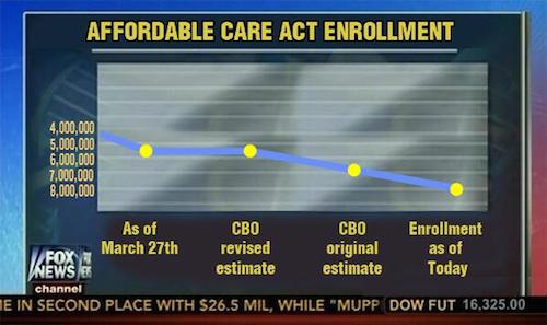
A fake chart the internet made to mock Fox News for tricking people
Miracle Mike Sebba sent me this beautiful graph with the caveat that it might be fake, and sadly it did not really air on Fox News. By “sadly,” I guess I mean “fortunately,” since in theory we are against misleading people. That’s why we’re so angry at Fox. The image above, with its y-axis reversed and crammed into the bottom half of the graph, is a fake issuing from the bowels of the internet. Don’t read too much of that Reddit thread, lest you encounter people who argue that it’s still a downward-trending line “even if you flip the numbers,” plus people who, after they know it’s fake, continue to decry Fox News for airing it. The point is that Fox News tricks people, even if you have to trick people into understanding that.
Here’s a graph that actually aired on Fox News and probably inspired the phony one at the top of this post:
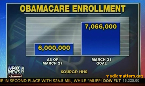
You can tell this one is real, because it says “Obamacare” at the top instead of “Affordable Care Act.” Also, Fox apologized for airing it, probably because it depicts six million as being approximately one third of 7.06 million. If you read all the way down to the bottom of the Wonkette post, you will find that the author explicitly doesn’t suggest that people launch a distributed denial-of-service attack against Fox in retaliation, which is the sweet spot between information and incitement where we all want journalism to be.
The internet is a weapon that the young and disenfranchised can use against the old, at least for the time being. I think we can agree that part of what’s troubling about Fox News is how many old people get all their information from the network. In many ways, it’s the monolithic, ideologically manipulative news monster that we wanted to believe existed during our youths.
Fox is the most watched cable news network. The average age of its viewers is 68, which is terrifying until you consider that the average age for CNN and MSNBC viewers is 60, and the average for broadcast networks is 62-64. Television news is for old people. While the broad societal complaint is that Fox News cheapens discourse and deliberately misleads America, the visceral complaint is that it’s doing that to our parents.
Which returns us to our phony graph, a telling example of Fox’s mendacity that happens to be made up. Like the cable news network, the internet is a source of information that our parents accept less critically than we do. Plenty of people get taken in by web satire, but anecdotal evidence suggests that Mom and Dad are more troll- and hoax-vulnerable than people who (sort of) grew up with the medium. If we could perform a statistical analysis of Christmas dinner conversations worldwide, I suspect that the two most common sources of erroneous sexagenarian opinion would be A) the internet and B) Fox News.
So is it cool to emphasize the unreliability of (B) by propagating a false example on (A)? Obviously, the purpose of spreading any kind of misinformation on the internet is lulz, which is like laughter only about to succumb to sleep apnea. Still, let’s imagine that this fake graph has a purpose, and the purpose is to satirize Fox.
The message here—the satirical subtext, if you will—is that Fox News is a misleading source of information. Is it ethically correct to convey that message by misleading people into thinking this is a real Fox News graph?
We’ve talked about misleading satire before in re: The Daily Currant, but there the satire in question was not funny. Strictly speaking, it was not too good to be true, and that was the problem. By comparison, our phony graph is pretty funny. But it’s also presented as a screen cap, with the crawl and everything. It’s funny because it’s true; without the bitter patina of Fox News airing it to radicalize your dad, it’s just a very bad graph.
This bogus Fox News graphic arrives at the same place as The Daily Currant by a different route. It’s satire that provides no indication that it’s satire—also known as lying. And if we accept that the problem with Fox News is that it leads its viewers to what it considers correct conclusions through deceptive means—for example, misleading graphs—then this misleading graph is immensely problematic, although it conveys a message with which we agree.
Propaganda is propaganda, in other words, even if it does emerge organically from the internet. Plenty of people have been tricked by this phony screencap, including this college statistics professor. Are we combating misinformation by giving people false evidence for the correct belief that Fox News is tricking people? Or do we consider our national discourse a scramble to get stupid people to believe what we believe, so that more misinformed opinions coincide with the truth?


Old folks used to fall prey to people who came to the door selling household repairs, or who stood outside the bank asking if they could use the stranger’s bank account to cash their (bogus) check. Now they enter our homes via the internet or television screen, speaking our (tribal) language to reinforce our pre-existing ideas.
Is the screenshot illustrating the difference between satire and lying or satire and pranking? A good prank might contain the humor and critical edge of good satire.
If this graph is fake, it was inspired by the fact that Fox admitted to a misleading graph:
http://mediamatters.org/blog/2014/03/31/dishonest-fox-charts-obamacare-enrollment-editi/198679
Ladies and gentlemen, the internet.
I am disappointed that this is not a real graph. It would have been a beautiful illustration for my mom, who has bought into FOX news completely.
It also would have been an excellent example for one of my sisters who also teeters on believing that FOX is a reliable source of information.
Oh well. Even if this were true, it is not likely it would change my sister’s or my mother’s mind at all. They’d say it was a typo or that anyone could make that mistake.
Esse caso de falsidade de grafico da Fox é corriqueiro. esses erros são constantes, fak news está se tornando algo comum.
Tenho um site também se chama Falando de Hamburguer
1q9z5h
pm2atv
te4cc9
1r4gc6
7yaydp
jstyw5
gid6og
x4bktz
l33b29
Выигрывай бабло в онлайн казино! Топ слотов, акции, советы для победы! Присоединяйся
Игровые автоматы: секреты, тактики, бонусы! Поднимись с нами! Реальные обзоры.
https://t.me/s/official_starda/777
26a7xq