
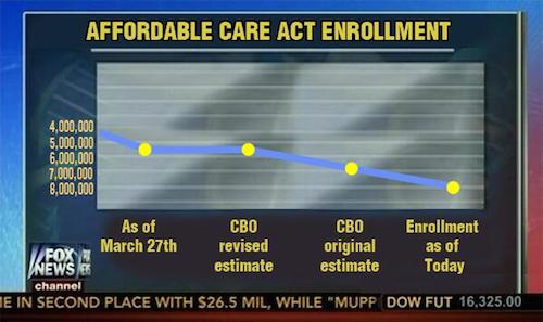
A fake chart the internet made to mock Fox News for tricking people
Miracle Mike Sebba sent me this beautiful graph with the caveat that it might be fake, and sadly it did not really air on Fox News. By “sadly,” I guess I mean “fortunately,” since in theory we are against misleading people. That’s why we’re so angry at Fox. The image above, with its y-axis reversed and crammed into the bottom half of the graph, is a fake issuing from the bowels of the internet. Don’t read too much of that Reddit thread, lest you encounter people who argue that it’s still a downward-trending line “even if you flip the numbers,” plus people who, after they know it’s fake, continue to decry Fox News for airing it. The point is that Fox News tricks people, even if you have to trick people into understanding that.