Former Secretary of the Treasury and gifted face-maker Larry Summers has calculated how much more middle-class households would make if the United States enjoyed the same income distribution it had in 1979, and the results are startling. According to his calculations, households in the bottom 80% of incomes would be making another $11,000 a year, on average, if we had experienced the same economy of the last 35 years without the growth in inequality. Households in the top 1%, on the other hand, would get $750,000 less. If you’re having a hard time wrapping your head around those two numbers, NPR’s Planet Money podcast has produced a helpful graph. Scroll down to see the whole thing—like six screens down.
Tag Archives: graph
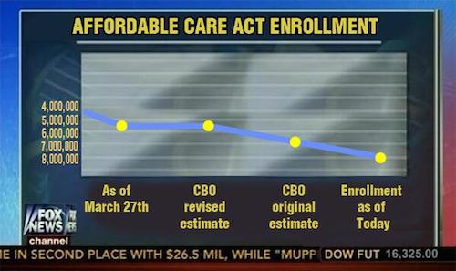
This misleading Fox News graph is fake
Miracle Mike Sebba sent me this beautiful graph with the caveat that it might be fake, and sadly it did not really air on Fox News. By “sadly,” I guess I mean “fortunately,” since in theory we are against misleading people. That’s why we’re so angry at Fox. The image above, with its y-axis reversed and crammed into the bottom half of the graph, is a fake issuing from the bowels of the internet. Don’t read too much of that Reddit thread, lest you encounter people who argue that it’s still a downward-trending line “even if you flip the numbers,” plus people who, after they know it’s fake, continue to decry Fox News for airing it. The point is that Fox News tricks people, even if you have to trick people into understanding that.


