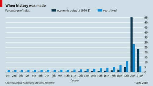
My friend Tarik sent me the chart above pursuant to an unrelated thought experiment. It comes from the Economist, which compiled figures from little-e economist Angus Maddison and the UN to plot economic output and percentage of total human-years lived against centuries. A human-year is a particularly useful unit of history if you prefer the broad trend hypothesis to the Great Man Theory. As the Economist puts it, “if people do make history, as this democratic view suggests, then two people make twice as much history as one.” Fact: two people, each living 70 years, experience more human time—that is, history—than one person living 70 years. Given that the life expectancy of your typical eighth-century serf was like 28, the lion’s share of human experience has taken place in the last century.
The 20th century was also the first period in which the percentage of total economic output exceeded portion of total years lived—by a lot, you’ll notice.*  While the human-years put in since 1900 account for about 35% of the total, the same period produces almost 80% of economic output. The conclusion is obvious: those of us who are currently alive are contributing way more than our fair share to the historical pie. Did you know that almost 50% of the living in this history is done by people who contribute less than 2.5% of our economic output? That’s called a free ride, and it’s part of the reason history sucks today.


This is one of those graphs of an abstraction that makes you think more concretely about a subject. What the hell is economic output anyway? I understand that with my middle-class access to clothing, food, transportation, and entertainment means I live like a 14th century monarch. But if all I’ve ever done is take orders and deliver food to tables, my economic output seems pathetic both by today’s and 14th century standards.
I can only conclude the economic side of the chart is a testament to the power of human organizing systems under ideologies like capitalism and democracy without limiting ones like sustainability. My contribution as a server may have been meager, but it’s effectiveness when part of a large system that determines when and where we each take our particular types of employ is magnified. And so I have more stuff.
As for the years-lived portion of the graph, I can’t think of any way that changes our moral systems or thinking about history. Perhaps historians tend to write about the past like it is larger than the present since there is so much more of it, but even noting that the majority of human experience is happening in the last 100 years doesn’t change the conclusions historians might draw. I suppose it might mislead the hoi polloi into believing the study of history has even less value than it already does.
In this case, economic output refers to total value of goods and services produced. That’s obviously more and more of an estimate as we move backward through centuries, but the massive uptick is a consequence of A) industrialization and B) dramatically increased population.