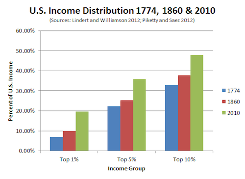
If only there were some way to make this graph that did not put percentages on both axes. That would be class warfare, though. You’re looking at a visual representation of historical US income inequality that is A) extremely conjectural in red and blue, and B) terrifying. It’s from this article in the Atlantic, which tentatively alleges that ours is a less equal America than it was on the eve of the Revolution and the Civil War. Numerous qualifications after the jump.

