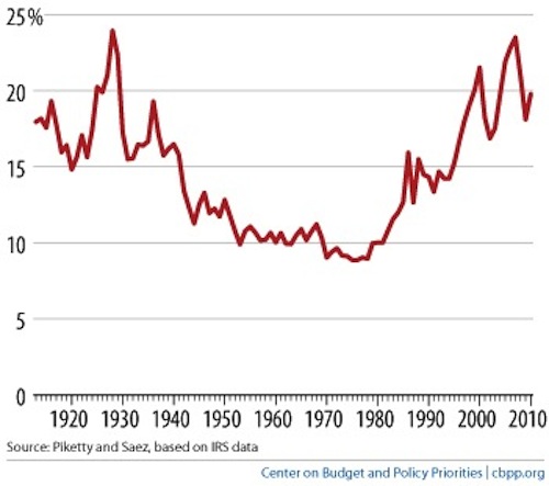
Graphs, graphs graphs! First of all, I don’t get punished for using a spectacularly uninteresting visual image for my header, because you are already looking at this page. All your hits are belong to us. Second, that image is actually totally interesting. Had I not cropped out the title, you would know that it plots the percentage of total US pre-tax income—including capital gains—garnered by the wealthiest one percent of earners. A lot of people have said that the interesting thing is its impressive upward trend right around 1980, when America began the long fight to make the Laffer Curve a legitimate conceptual instrument. I personally think the interesting thing is the locations of its two highest peaks, in 1929 and 2007, respectively. I’m not saying economics is a science, but maybe there’s some sort of principle at work there. It’s Friday, and today’s link roundup is all about weirdo economic phenomena, plus judo highlights and a book review. I’m not entirely stupid.

